Case study
Stock Unlock, inside a fundamentals-first stock research app
- Role
- Senior Product Designer. Design, prototyping, micro-interactions, working prototypes in React
- Team
- Jake (CEO), Daniel (Product), 4 engineers
- Timeline
- September 2024 to March 2026 (18 months)
- Scope
- New iOS/Android app from scratch, narrative layer over an algorithmic scoring system, web platform redesign
Context
Stock Unlock is a YC-backed investment analysis and portfolio tracking platform built around fundamental analysis. By the time I joined, the product had years of features and opinions baked into it, and a user base that was vocal about what they liked and what they didn't.
The team had been engineering-led up to that point. The product was solid, but design hadn't been a dedicated function for a while. Early on, Jake told me to design the best stock research app in the world, and not to worry about what we can or can't build. I took that at face value.
01 / Mobile app
Fitting an investor's worldview onto a phone
The mobile app was the biggest piece of work, and it was never meant to be a companion to the web platform. The goal was full feature parity: an app a new user could pick up and do everything on, without ever feeling they were missing something the web platform had. That was a commercial bet as much as a design one. The app would be marketed on its own, to people who might only ever know Stock Unlock as a phone app, so a lighter version would have undercut the point. The other half of the brief was the thing a phone does that a desktop cannot: it keeps your portfolio and your research with you wherever you are.
The web platform was dense by design. People came to Stock Unlock specifically because it surfaced more information per screen than its competitors did, and that density was the product. Translating it to a phone meant either compressing the density without losing it, or accepting that mobile would always be the lighter cousin of the web. Nobody on the team wanted the second outcome.
Most of the design work was variations on a single question.
How do you fit a fundamentals investor's worldview onto a five-inch screen without diluting it?
The question plays out hardest on the two screens a user opens the app to reach.
The portfolio
What it's worth and how it's holding up. It became the home screen because a portfolio is the user's real savings, the thing they come back to check most.
Any stock
Its price, how it's moved, what's changed since they last looked. A user reaches it through search, where the research itself happens.
Getting into the portfolio
The portfolio is the home screen, which means a brand-new user with no portfolio would land on an empty one. The first screen of the app exists to prevent that. It offers three ways to start. Connecting a broker account syncs a real portfolio automatically, and it is the path we steered most users toward. Creating a manual portfolio works for anyone but is slow on a phone. The demo portfolio drops the user into a fully populated portfolio they can explore before committing anything, which matters because handing broker credentials to an app installed minutes ago is a real ask.
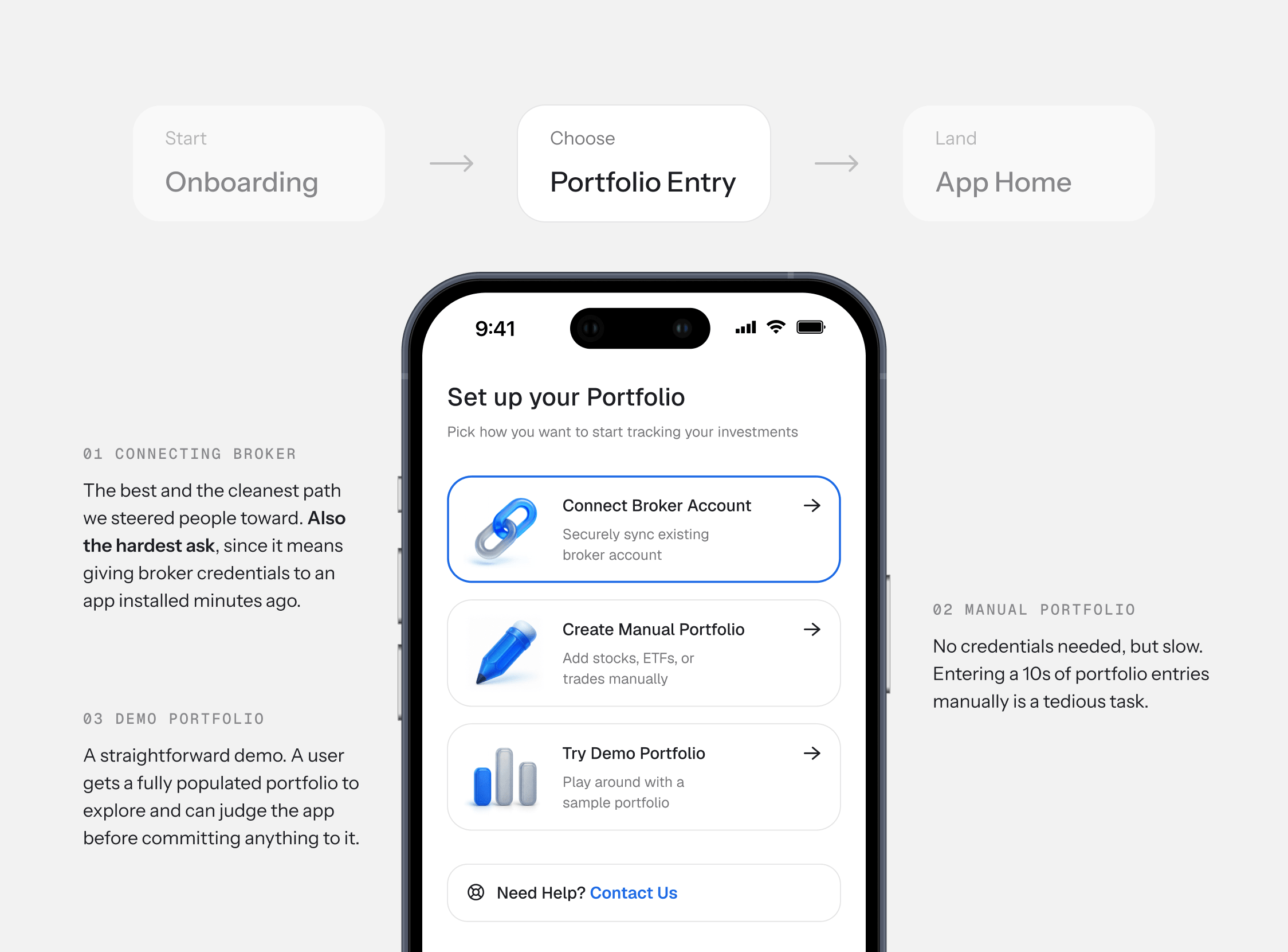
The three options are ordered by what they cost the user, best outcome at the top, lowest barrier at the bottom. Nobody has to choose between handing over their credentials and walking away.
The Portfolio
A fundamentals investor wants five things on one screen: what it's worth, how it's doing, whether they're up on what they paid, how healthy the holdings are, and what's happening. This screen answers all of them on a single scroll without collapsing into a wall of numbers.
Portfolio Showcase


The return number above the chart changes when you switch timeframes. Pick 1Y and it shows the yearly return. Pick 1M and it recalculates. They're always in sync.

The fundamentals score sits here, below value and performance. An investor is more likely to check the stock price daily than a portfolio score, which only shifts on earnings and similar events. Performance leads, fundamentals follow.

Fundamental weaknesses across a whole portfolio could fill a screen of their own. The warnings pill puts them in one line: how many holdings have a problem, with the detail one tap away. It flags the whole portfolio's health and costs the screen almost no room.
The colored ring around each stock's logo shows its fundamentals score. Green is strong, red is weak. The user gets a health check on every holding without any extra UI taking up space.

No two investors look at the same numbers, so the metrics row isn't fixed. You can show, hide, and reorder anything in the list.

A user comparing day-change to all-time return is asking two different questions of the same list. The view-by control swaps the data column for the entire list at once.

The portfolio's fundamental health broken down across six dimensions. The radar chart shows the overall shape at a glance. Below it, each holding expands so you can see which stocks are pulling a given score down, with weaknesses tracing back to the exact ticker driving them.
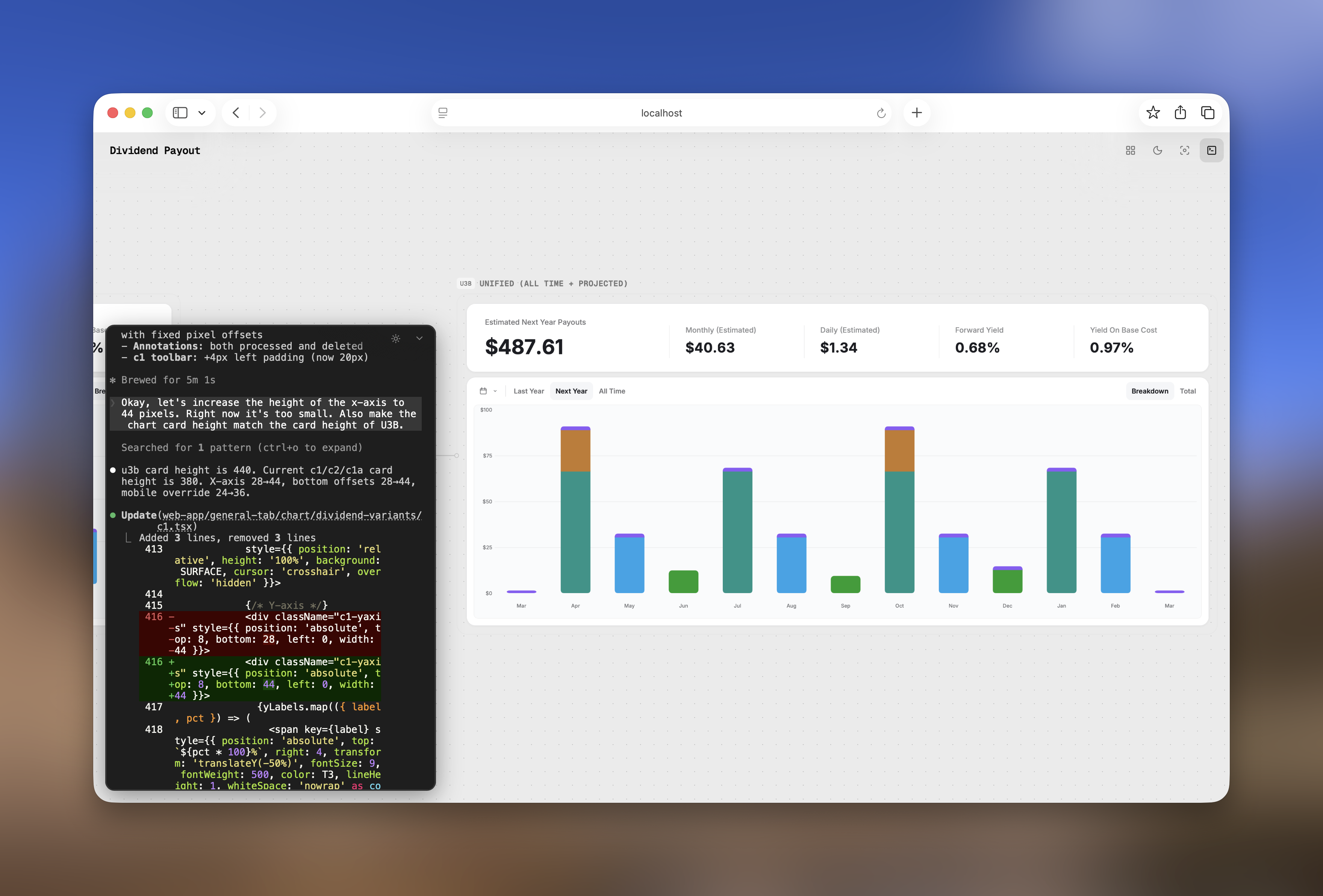
Dividend income projected for the next year, broken down to a monthly and daily number. The bar chart shows how payouts distribute across the calendar. Tapping "View Monthly Income Breakdown" opens a per-stock schedule for each month.

Every event that matters to the portfolio on a single timeline, with comprehensive filters.

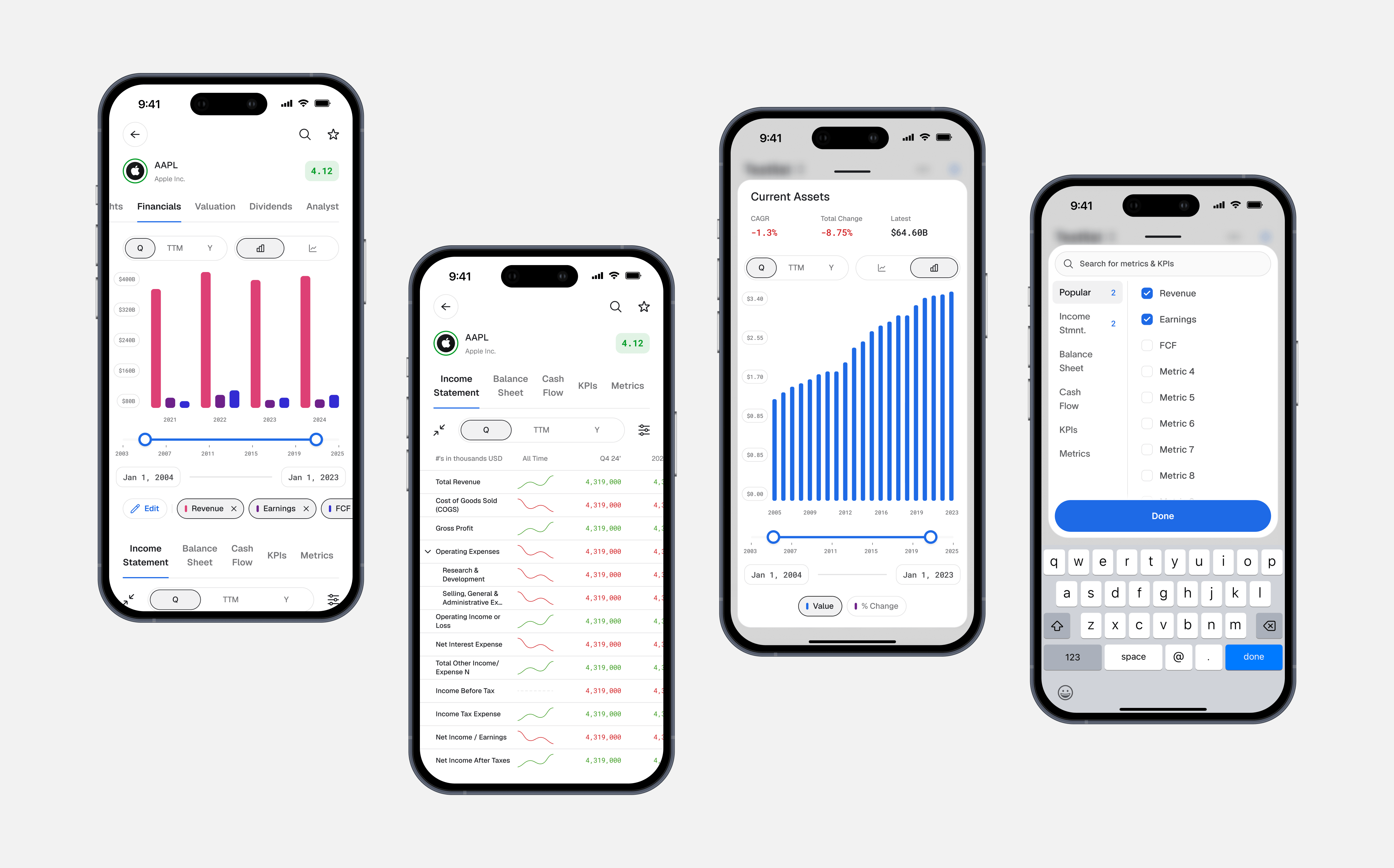
Stock Research: The Financials
The financials are where the research actually happens, and the densest surface in the app. The density is mostly controls. A fundamentals investor operates them: switching timeframes, setting the window, comparing revenue against earnings against free cash flow, moving between a chart and a table, drilling into a single line item. Fitting that whole operating surface onto a phone, without a wall of toggles, came down to three decisions.
- •
Controls stay consistent. The timeframe switch, chart-type switch, and range slider sit in the same place and behave the same way on every screen. A user learns them once.
- •
Depth is one tap away. The statement stays a scannable list, each row carrying a sparkline for shape. Tapping a row opens that line item's full history with its growth figures.
- •
The metric set is the user's. Which metrics appear on the chart is theirs to choose, the same call as the portfolio's metrics row.
What I got wrong: muscle memory
Since the web platform had been running for years, it had its own established patterns. One of the earliest calls I made on the mobile app was about allocation breakdowns. The web had used donut charts for this for years. I thought donut charts were the wrong shape for a phone.
The allocation view is a chart sitting above a list of stocks and their percentages, with colored markers matching the slices. The chart and the list are meant to be read together. On a phone, a donut chart big enough to read takes nearly half the screen, which pushes most of the list out of view. To read the list, the user has to scroll, which pushes the chart out of view. They end up scrolling up and down to make connections that should happen in a single glance. A horizontal bar chart takes a fraction of that height and lets the chart and the list sit on one screen together.
I made that case internally and we shipped with bars across the app.

After we shipped, the pushback from users was steady. They wanted the donut charts back. Most complaints came from longtime web users with years of muscle memory for the donut chart shape. I reverted within the week. The user signal was clear and consistent, and defending the technical argument wasn't worth the cost of users feeling like the product had changed on them.
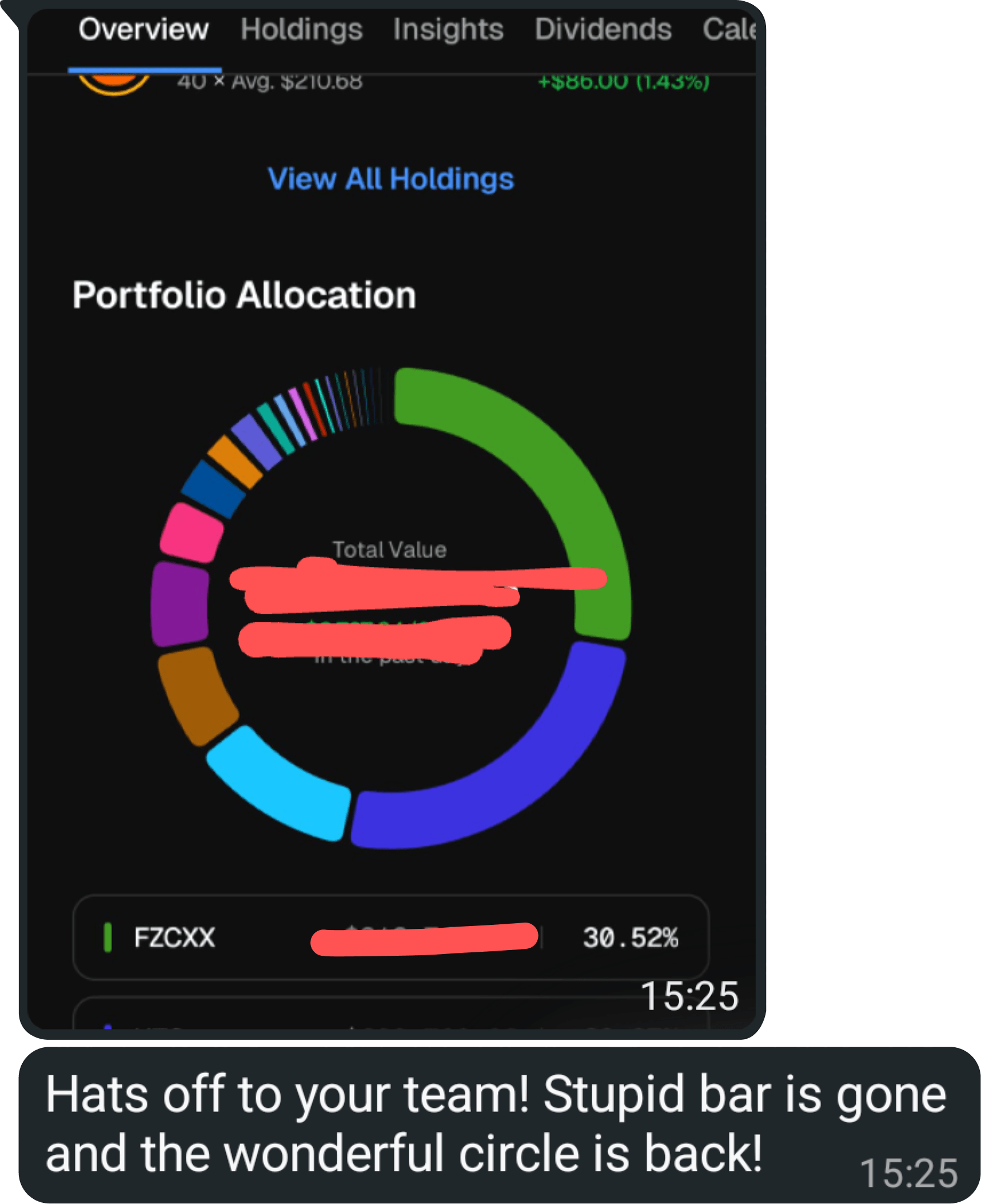
A longtime user when the donut charts came back :D
The technical case for bars was right on its own terms. What I underweighted was muscle memory. For longtime users, the chart shape was part of how they recognized the product. I now treat muscle memory as a real product surface, especially with long-established patterns.
02 / Score ecosystem
Giving an algorithm a voice
Stock Scores is the core of the product. Every stock gets a 1-5 rating built from a valuation model and a fundamental score across six categories of business quality.


The way scores originally surfaced in the product was a list of numbers next to labels. My job was to give the algorithm a voice across every surface it touched. The score card was designed as a self-contained unit that could be screenshotted and shared. That constraint shaped the layout: everything a viewer needs to understand the score is inside the frame, no surrounding context required.

Historical Scores was the bigger of the two new features, and the more interesting design problem behind it was trust. People don't believe algorithmic ratings by default, and for good reason. Anyone who's spent time around finance has seen credit ratings be wrong, broker ratings be wrong, and sell-side analysts be wrong. When a number tells a user that a stock is cheap or that its profitability is suspect, the first reasonable question they have is whether the system saying so has been right in the past.
Historical Scores lets users answer that question themselves. The user scrubs through a stock's price history, and underneath the price line, a colored band shifts between red and green to show what the algorithm was scoring at every point in time. Where the band was green and the price went up, it was right. Where it was red and the price went up anyway, it was wrong.
03 / Web platform
Rebuilding the tools investors use most
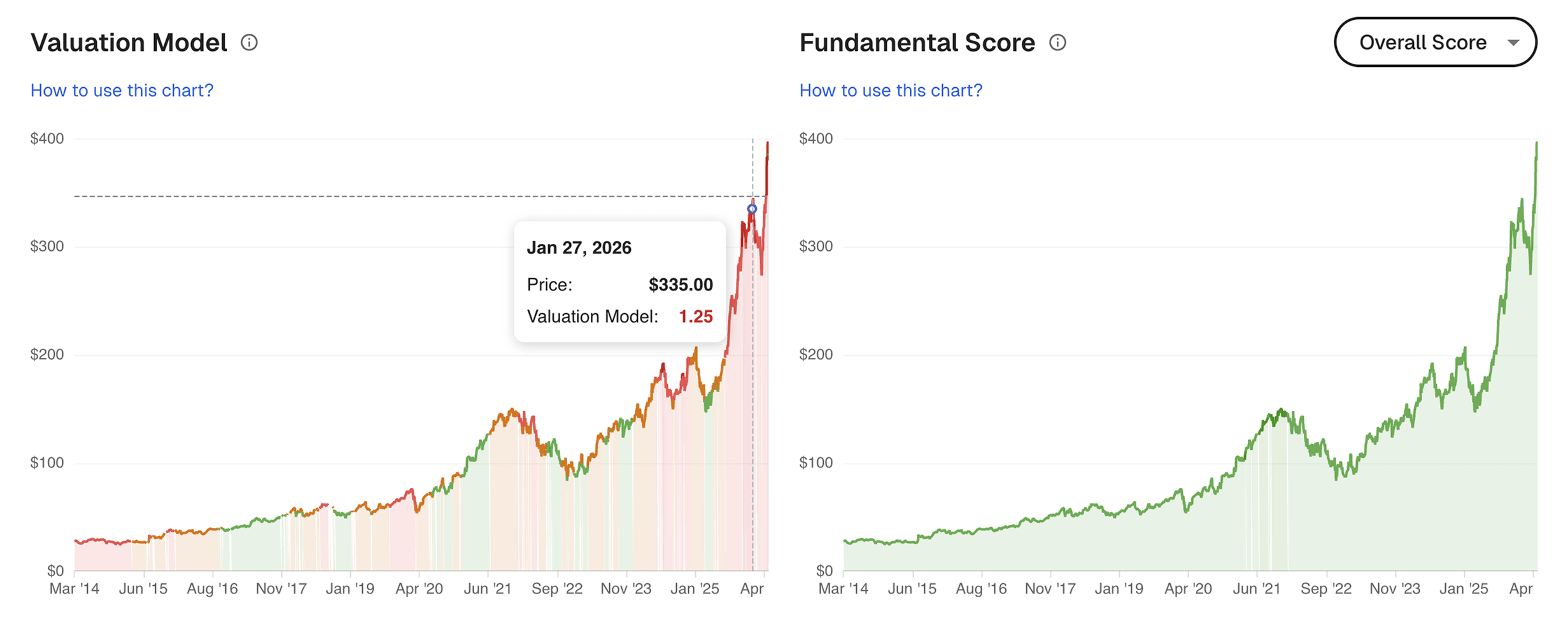
Charts on a research platform are how users form opinions about a stock over time. The legacy charts on Stock Unlock's web platform were functional but flat, and they were the only part of the platform that hadn't really evolved in years. I rebuilt the whole chart system end to end. The how of the rebuild, the fact that I built them as fully working React prototypes instead of handing off Figma, is its own story further down. This section is about what changed in the charts themselves and why.
The price chart
The price chart is the most-used component in the product. It needed to work as an instrument, not just a display. The redesign supports multi-stock overlays where users can layer comparison stocks on top of their primary pick, multiple timeframes from 1D through Max, interactive scrubbing with data readouts that update as you move across the chart, and a custom-period feature where users can define their own time window beyond the fixed presets.
Building this as a working prototype with real data rather than static Figma screens made a difference. A drawn line in Figma looks the same whether it represents a week of price history or ten years. With real data in a working prototype, you immediately see how the chart behaves across wildly different data volumes, which states surface that you never thought to mock up, and where the layout breaks under conditions you wouldn't have drawn by hand. Edge cases and intermediate states that would have been missed in a static handoff got designed by default because the prototype had to handle them to work.
The dividends chart
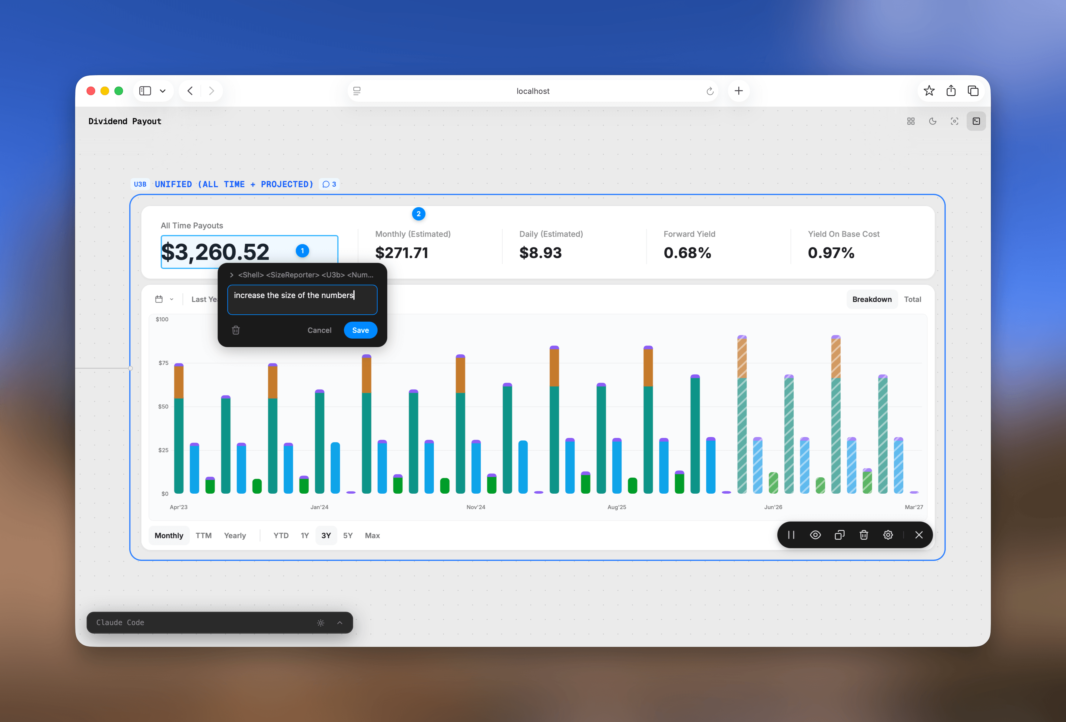
The dividends chart is the one I'm proudest of in the whole chart system. Dividend information is usually presented as a table, partly because dividend income is by nature backward-looking and slow-moving and tables are honest about that. The redesign turned it into something a user actually wants to spend time inside.
The chart shows portfolio dividend history and projection in a single view. Payouts so far this year, projected payouts for the rest of the year, historical totals going back as far as the user wants to look, and the breakdown of which company paid what. The user can switch between an aggregate view (total dividend income over time) and a per-company breakdown. The numbers animate smoothly between modes via a number-flow library, and the result is hard to convey in screenshots and worth seeing in motion.
Upgrading web search
Stock Unlock's old search did one thing well. The user typed a name or a ticker, got a list of matches, and clicked the one they wanted. That was the entire contract.
The redesign was a chance to push search past that contract. Could it become the fastest way to navigate the entire product?
The feature that pulled the most weight was semantic page-jump. Every stock in Stock Unlock has a dozen pages behind it: financials, valuation, scores, dividends, analyst ratings, insider activity, and so on. The default way to get to any of them is to find the stock first, then hunt through tabs. But if the user already knows they want NVIDIA's scores, that's three taps and a wait to do something they could have expressed in five characters. So I designed the search to recognize those five characters. Type NVDA scores and instead of returning partial matches for things containing "NVDA" or "scores", the modal collapses into a single card that takes the user straight to the scores page for NVIDIA. One keystroke. The shorthand version works too, so NVDA sc gets the user there, and AAPL fin lands on Apple's financials.


Everything else is built around that center of gravity. The keyboard model lets power users never touch the mouse, with subtle key-cap hints in the modal footer. The cross-listing model surfaces every exchange a stock trades on within the same result row, so international users don't dead-end when their version of NVIDIA isn't the US one.
04 / How I work
Code as a design tool
I've always worked close to code. I read it, I think in components and systems when I design, and my handoffs at Stock Unlock were production-grade working prototypes instead of flat Figma files. The chart and search prototypes in this case study were built that way.
My workflow moves between Figma, Claude Code, and Codex depending on what I'm solving. On the search redesign I went back and forth using the Figma MCP plugin, building in code, pulling it back into Figma to fix padding and spacing, then bringing corrections back into code. The two tools feed each other. I get to see my designs come to life exactly the way I imagined them, instead of waiting for an engineer to translate them and hoping their version matches mine.

Designing in code has one annoying limitation though: it's linear. Every iteration overwrites the last one and you lose the trail of how and why the design got there. The fix I built for myself is Protocanvas, a canvas that keeps every version live and visible side by side, so the whole evolution stays in front of you instead of getting overwritten. The chart prototypes earlier in this case study were built this way, with Protocanvas and Claude Code.
05 / Learnings
Narrative as a first-class design layer
Stock Scores taught me something I hadn't fully internalized before. The hardest design problem at Stock Unlock turned out to be narrative. The algorithm was already excellent and the score card was already on the page, but what was missing was the layer that turned the numbers into something a user could read in five seconds and walk away from with an opinion. Historical Scores, Warnings, and the score card reshape were all the same kind of work: building the connective tissue between a system's outputs and a human's decision. I now think of narrative as a primary design surface in its own right.
Code as the new handoff
The shift I made at Stock Unlock, building chart and search prototypes in React instead of handing off Figma, was really a change in how I think about what design work actually is. My deliverable became a working front end with the data layer left for engineers to wire in. That's a different role from the one I was trained for, and I'd rather be early to it than late.